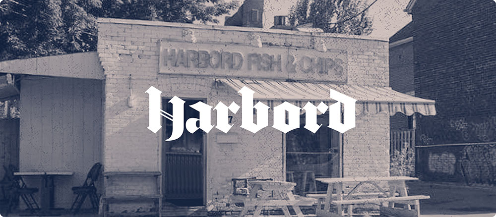
If you are wondering whether the chicken came first or the egg, we can confidently say it was the chicken. Harbord Fish & Chips started with a solid foundation – opening its doors in 1988 with a focus on fresh seafood and delicious chicken dishes.
GOAL
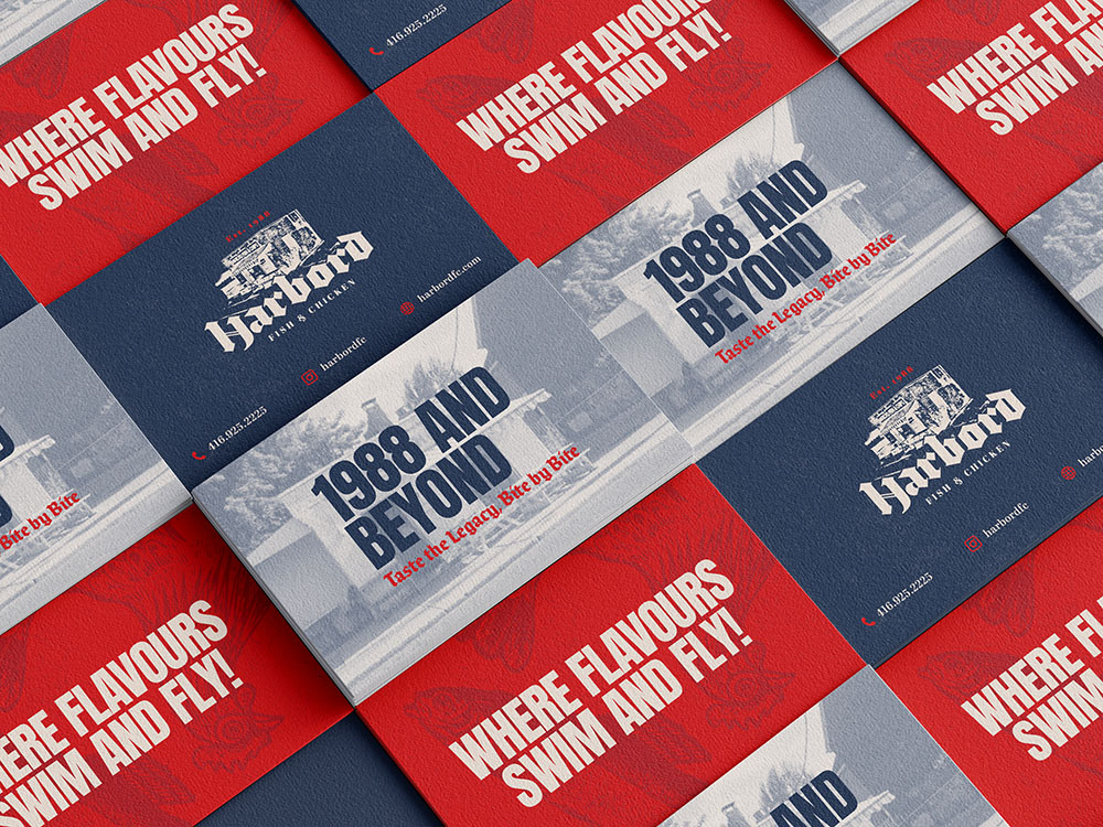
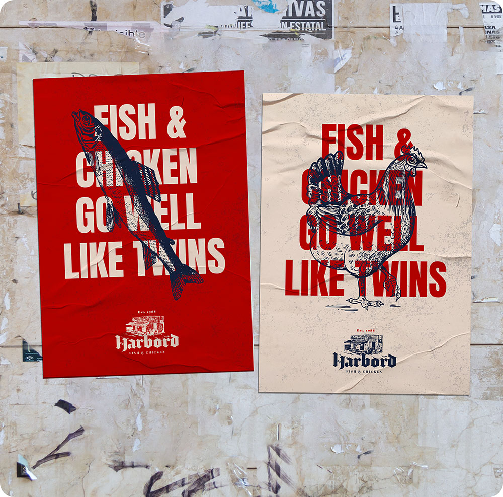
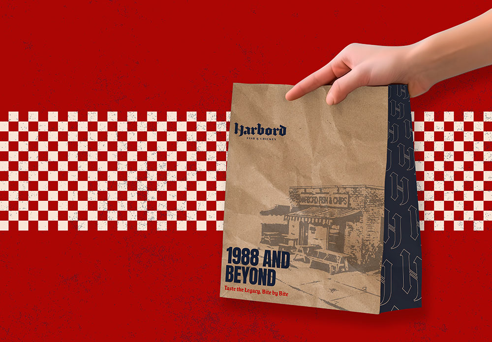
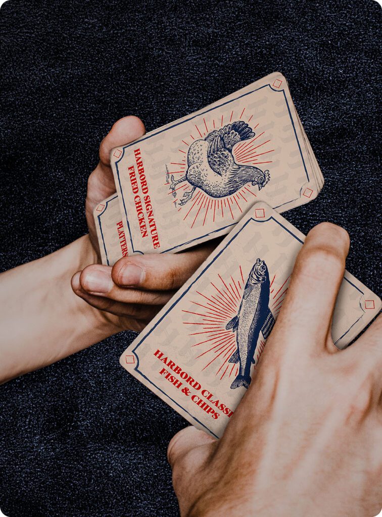
Harbord Fish & Chips wanted to rebrand themselves to Harbord Fish & Chicken. However, they wanted to maintain a brand identity similar to what it was known for previously. They wanted a slight pop of colours with a vintage theme to make the brand stand out.
APPROACH
Our main goal for Harbord Fish & Chicken was to create a visual identity that was modern, professional, and instantly recognizable. As it has been a renowned brand in Toronto since ‘88, we ensured the brand retained its vintage charm while adding a touch of fun.
SOLUTION
Our rebranding transformed it into ‘Harbord Fish & Chicken,’ unlocking numerous marketing opportunities with a new and polished logo. Our comprehensive approach included restaurant design, website design, packaging, and establishing the right brand tone for its social media platforms.